
Website update
A massive rework of the iono.fm website delivers a much-improved experience for our publishers and listeners.

A massive rework of the iono.fm website delivers a much-improved experience to our publishers and listeners.
The iono.fm website has served millions of listeners and thousands of publishers, but has remained relatively unchanged for a long time. Our latest release remedies this situation and delivers a truly modern experience to our users.
During this redesign, we had several big goals in mind:
- Reduce visual clutter and improve clarity. Focus the user's attention on important page elements and remove extraneous page content.
- Simplify page actions. Highlight specific actions and group complex information together.
- Publisher page navigation. Allow users to easily browse between the content of a specific publisher.
- Improve audio playback. Make the audio listening components cleaner and easier to use.
- Improve mobile layout. Most listeners visit our website via a mobile device, so we want to ensure all aspects of our site are improved on mobile layouts.
- Page load time. Reduce the time a user has to wait for a page to be rendered and becomes responsive.
We feel that the reworked website lives up to all these goals, and this article provides some details on each of them.
Visual clarity
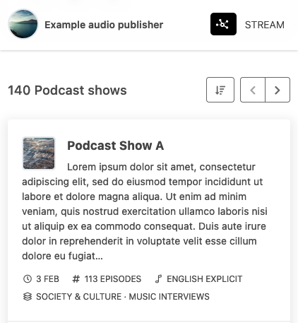
Perhaps the largest visible change is the drastic reduction in the number of links displayed on most pages
Whereas previously every list item included several different links, each item is now a single clickable entity which presents a much clearer action to users.
The right-hand sidebar showing "related" content was another significant source of page complexity, taking focus away from the primary page contents. Removing it also allows more space for all the other page elements.
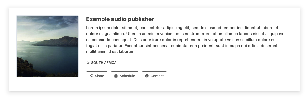
Wrapping our main content areas in "card" styling allowed us to visually group related information.
Simplify page actions
Actions available to users on the site worked in different ways and relied on non-obvious functionality that was difficult for users to find and use. All page actions have now been consolidated into specific buttons that clearly signal the user intent, for example "Share", "Follow" or "Contact".

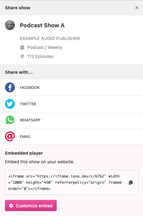
The complexity behind each of these actions has been relocated to a drawer component - this enables a rich display without any clutter on the page itself.
Drawers also provide a side benefit in that they adapt really well to mobile layouts where they are essentially full-page components.
Publisher page navigation
Many smaller publishers do not have their own websites and use our web pages as their primary (or only) web presence for their content. For listeners interested in these publishers, we wanted to improve our publisher's pages to fit together in a more coherent "mini-site" inside our own site.
To enable this we've added a new "context bar" at the top of all publisher content pages. It shows a clickable breadcrumb hierarchy of where in the publisher content a listener is, along with a direct link to the live stream page for radio broadcasters.

By making this context bar "sticky" when a user scrolls down, combined with allowing our main navigation bar to scroll out of view, we further focus the user's attention on the publisher's content.
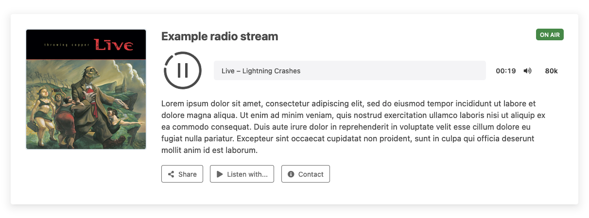
Improve audio playback
Listening to audio is the primary goal for any listener visiting our website, so we took care to improve this core experience. Previously we relied on our normal embedded player, but this resulted in a cluttered look, with duplication of content and slower loading times.
The website now integrates it's own player user interface. We've moved the player up to below the title to ensure it's always above the fold even on mobile layouts. To further strengthen this primary call-to-action we've also increased the size of the play button.
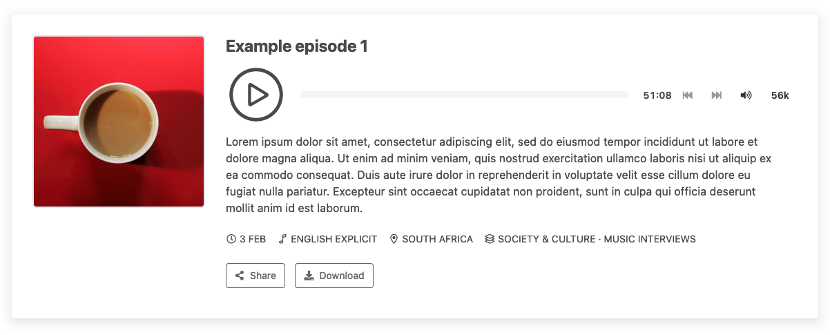
Besides various other enhancements, our stream now shows any album artwork prominently in its artwork area while playing.
Mobile
The majority of listeners will be visiting our website from a mobile handset, and accordingly, this update enhances the mobile experience. For all pages and views we've improved the mobile layout to provide a richer view than before.
Admin panels and controls were also adjust to be more usable in mobile views
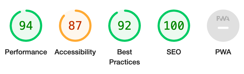
Page load times
Our site has always performed relatively well, but this release further reduces page load & render times, in addition to better SEO metadata and other improvements.
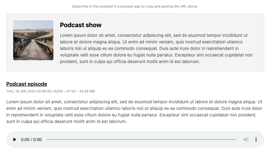
RSS
Just to cover all bases, we have also updated the styling we apply when a podcast RSS URL is opened in a browser. This simple styling update makes feeds much more readable and gives direct playback access to the episodes.
Layouts
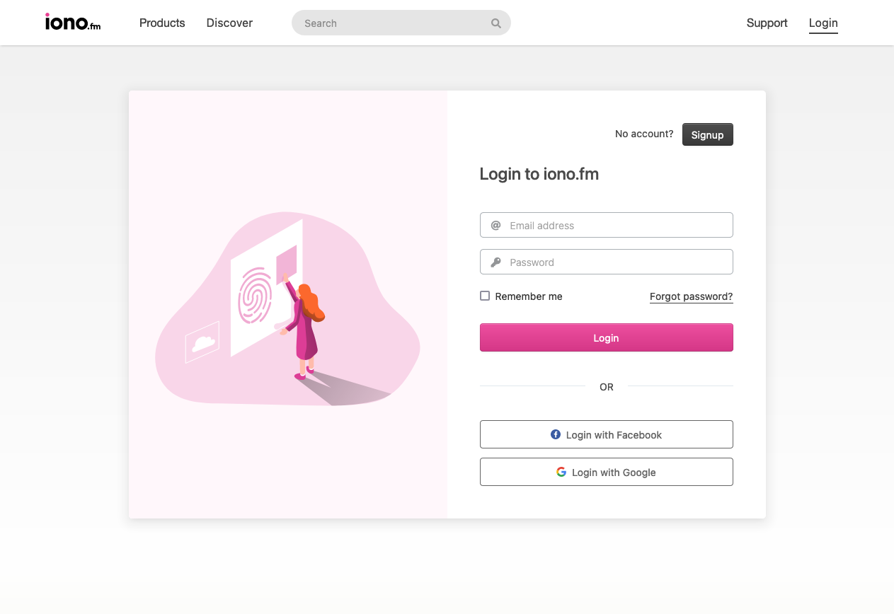
In general our site layout was improved on every page. Perhaps the biggest example of the improved user experience is our login page, which now features a modern layout in line with other sites.
And one more thing..
Our new vector based website favourite icon is quicker to load, scales better to different sizes and now works great on both light and dark themes.

Visit iono.fm
Cover photo by Med Badr Chemmaoui / Unsplash